How to quickly select the most suitable color in millions of colors?
Summary
Background
- Written for designers, you may be building a color system in your product design
- Have used HSL, and have a basic understanding of color models and color spaces
Best Practices

-
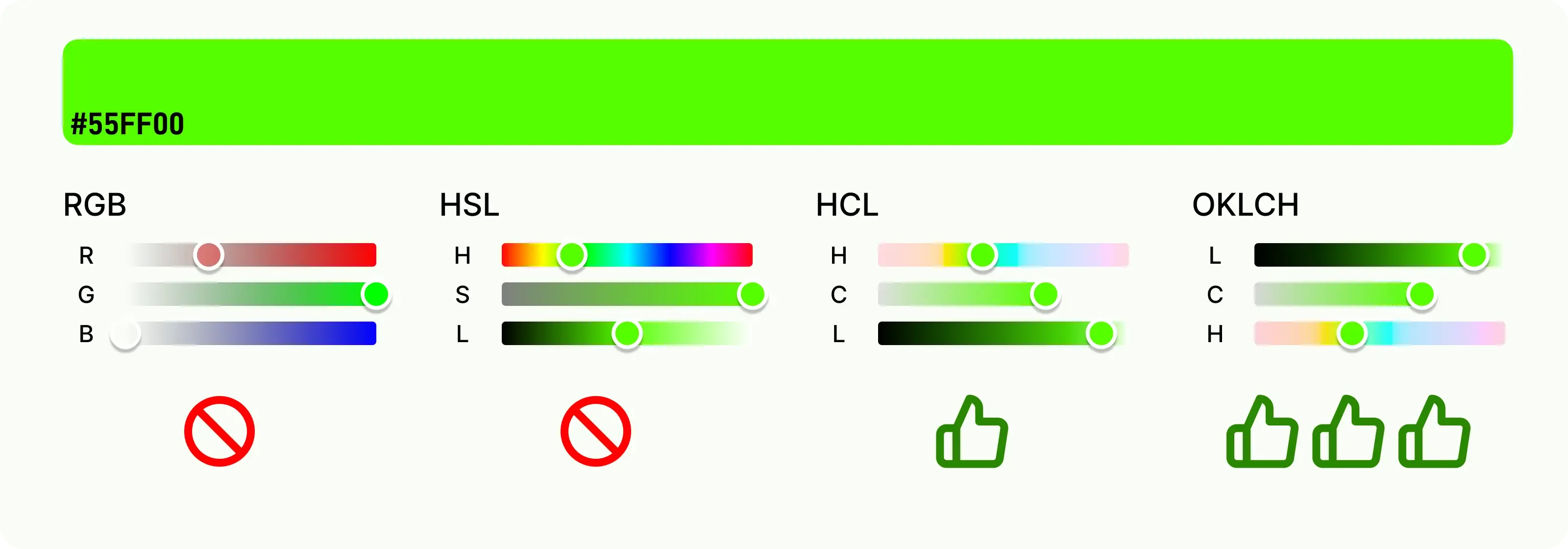
Recommend using a color space based on “perceived lightness” instead of HSL
- The perceived lightness with the same numerical value has nearly the same visual effect
- More effectively predict contrast, more stable to build color levels, easier to meet color accessibility
-
This article recommends OKLCH color space, which is the polar form of OKLAB
- ✅ OKLCH uses three easy-to-understand components: “perceived lightness L - chromacity C - hue H”
- ✅ OKLCH perceived lightness is uniform
- ✅ OKLCH minimizes the impact of chromacity on lightness (Helmholtz-Kohlrausch effect)
- ✅ OKLCH fixes hue shift (Abney effect)
- ✅ OKLCH supports encoding for a wider color gamut (P3, Rec.2020 and higher)
- ✅
oklch()has been added to the current CSS4 candidate version, and is supported by all major browsers, [compatibility](https://caniuse.com/mdn-css_
Gu Wei, Product Designer.
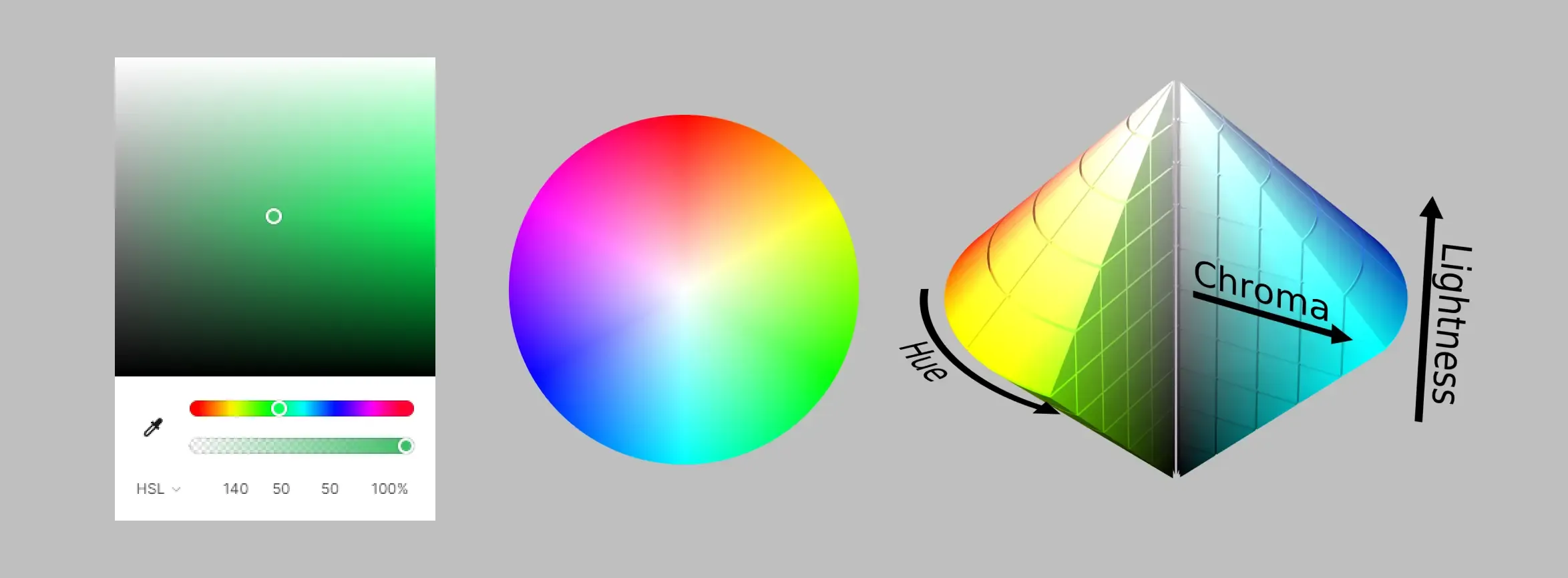
When designers are selecting colors, what are we actually doing?
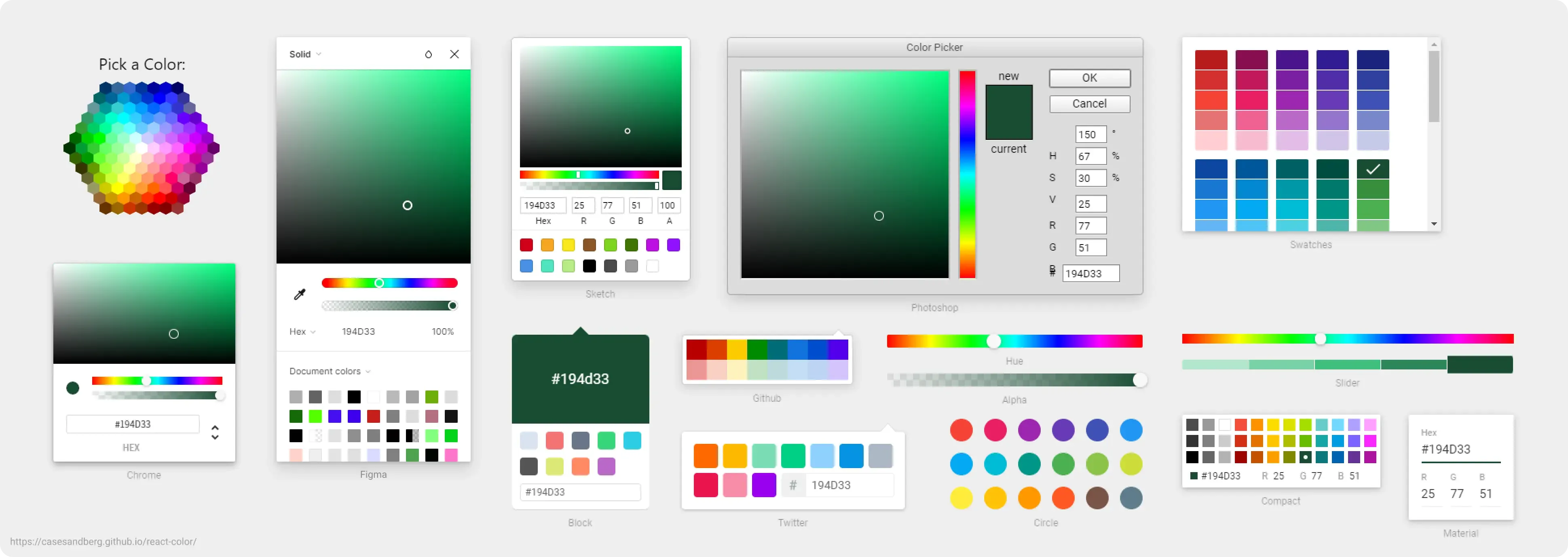
There are many color selection tools in various design software, our selection process essentially includes:
- Select a color space, such as sRGB, HSL, etc.
- Set the numerical value of the color space component to determine the color, such as adjusting H in HSL to modify the hue.
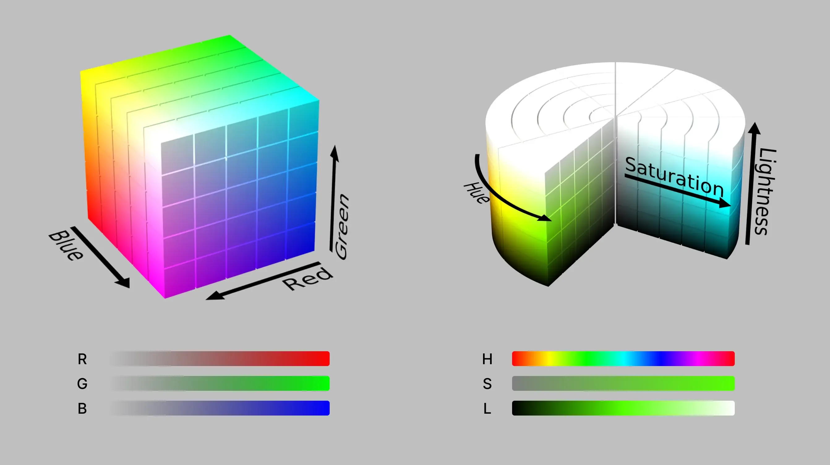
Color space (Color Space) is a specific combination range of colors, with two main characteristics corresponding to our color selection process.
The first point is “color gamut”, which indicates the entire color value range contained in the color space, usually expressed as the relationship between the human eye’s visible color range.
- Image from https://commons.wikimedia.org/wiki/File:CIE1931xy_gamut_comparison_of_sRGB_P3_Rec2020.svg
The second point is the component used to explain colors, which can also be understood as the coordinate relationship in the color virtual space.
- Image from https://en.wikipedia.org/wiki/HSL_and_HSV
In addition, some color space definitions also include “white point”, “gamma correction”, etc., which are not related to this article, so we will skip them for now.
Then, which color space should we choose?
RGB is a color model that is friendly to machines but not to humans
The RGB color model is defined by the superposition of red, green, and blue primary colors.
The main display mechanism of modern electronic devices is to combine the colors of single pixels by the red, green, and blue electronic components respectively. For each light-emitting element, it only needs to process the numerical value of the corresponding R, G, and B components to determine its own light emission brightness, without complex calculations.
The RGB color model is used to compare and convert colors in different devices by defining white points and gamma correction, forming different color spaces. Common ones include sRGB, Display P3, Adobe RGB, etc.
sRGB (including Hex format) is the most common and possibly the most widely used color space, currently the default setting for Web, and supports most display devices. The common representation is rgb(255, 255, 255) or #FFFFFF.
However, human recognition and use are very difficult. We cannot intuitively derive the mixed results of the RGB three color components, and it is only relatively easy to understand in specific cases (such as pure colors).
Which color is
rgb(131, 103, 210)/#8367D2?
Although experienced designers can usually determine the correct answer through some evaluation process, it is difficult to say that this process is worthwhile.
In addition, the intermediate part of the RGB gradient may cause the color saturation to decrease due to the close numerical values of the components, making it appear dull.
Conclusion
⛔️ RGB color model is difficult to identify and compare directly
⛔️ RGB color model often requires three components to be adjusted at the same time, the process is complex
⛔️ The intermediate part of the RGB gradient will lose saturation
PS: CMYK is a color model that is friendly to printing, but is also not friendly to humans
The brightness value of HSL is different from the perception of the eye
The HSL color space commonly used by designers is a specific coordinate transformation result of the RGB color model.
The three components of “hue H - saturation S - lightness L” are mapped to the corresponding colors in the RGB color model, optimizing the selection and adjustment process of common saturation and brightness in practice, making it more natural, intuitive, and easy to understand.
The common representation is hsl(360deg, 100%, 50%).
In the HSL color space, adjusting the hue H to display the gradient from hsl(0deg, 100%, 50%) to hsl(360deg, 100%, 50%) is the “rainbow bar” commonly seen when designers select hues.

Since human visual perception is not uniform, and the wavelengths of colors have different influences on the three types of cone cells in humans, we find that some colors on the rainbow strip are brighter, while others are darker.
By removing saturation, we can more intuitively see that the yellow to green range is significantly brighter, while the blue range is darker.

Calculating perceived brightness, we find that the brightest place has 92.8, and the darkest place only has 7.2.
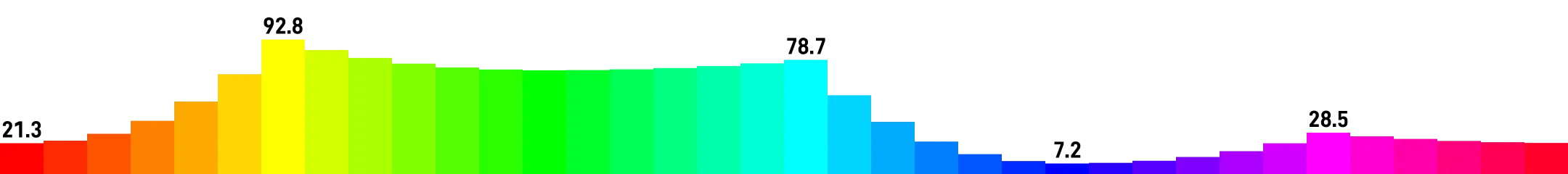
A color palette built on HSL has too great a difference in sensory level.
The gradient based on HSL may change unexpectedly due to the uneven perceived brightness of each hue.
❓ How much is the brightness difference between green
hsl(90deg, 100%, 50%)and purple `hsl(270deg, 100%, 50%)?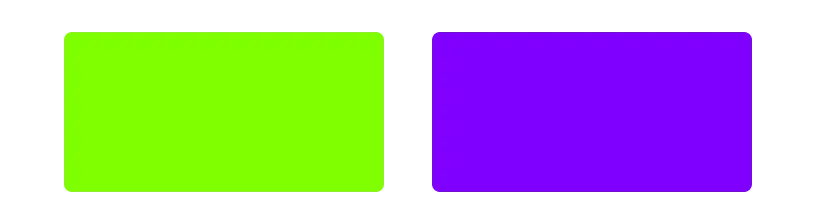
Compared to the purple text on the same background, green text of the same HSL brightness is difficult to see.

Conclusion
⛔️ The brightness component of HSL is not uniform in perception, making it difficult to evaluate color accessibility
⛔️ When the hue of HSL shifts, the perceived brightness will also change unexpectedly
PS: HSV (HSB) is another transformation of the RGB color model, and the situation is basically the same as HSL
HCL is one of the best candidates, but there are still some small flaws
CIELAB color space is defined by the International Commission on Illumination in 1976, the largest feature is to define the lightness L component, as close as possible to the human perception of brightness.
But the other two components a and b respectively represent the degree of red-green and blue-yellow, similar to the RGB color model, not very intuitive to use.
We hope to use the CIELAB color space like HSL, through easy-to-understand hue and saturation, which gives us HCL.
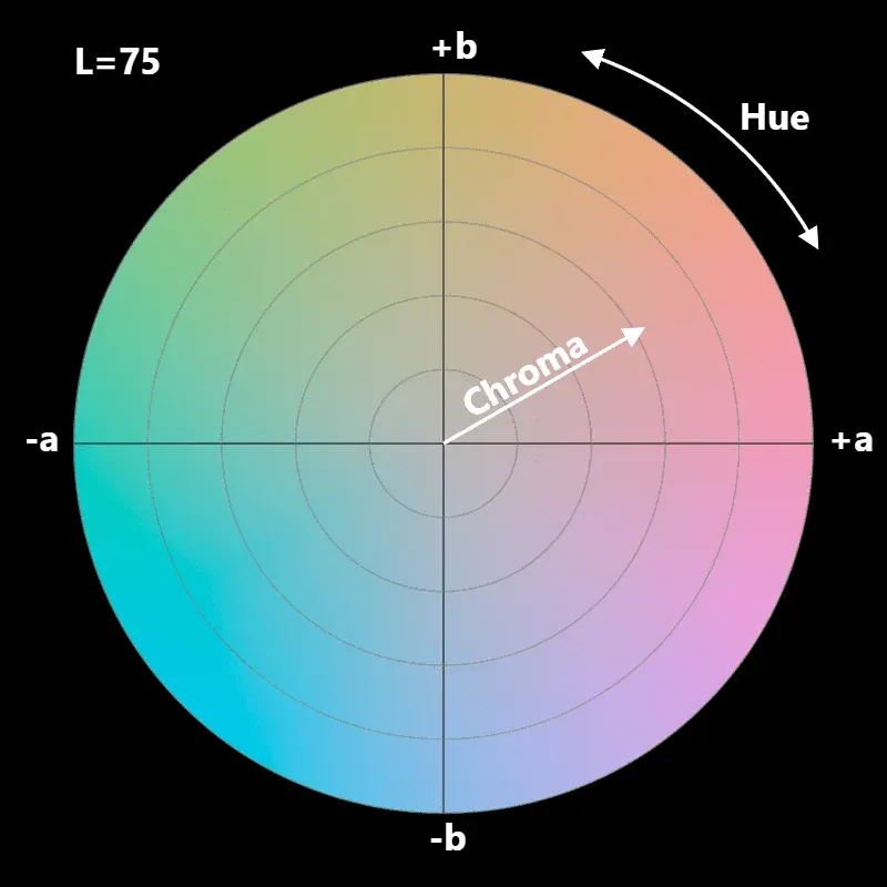
HCL color space (Hue-Chroma-Luminance, can also be adjusted to LCH) is the polar coordinate transformation of CIELAB. The three components of “hue H - chromacity C - perceived lightness L” are used to describe colors from the perspective of human visual perception, forming a color space with numerical values and perceptual uniformity.
The common representation is hcl(360, 40, 75) or lch(75% 40 360).
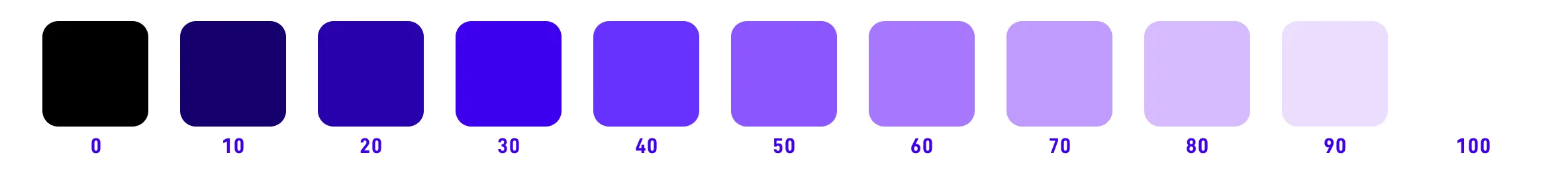
Below is an example of HCL when L=75, it is easier to see that the color has perceptual uniformity after removing chromacity.


When we set L to the same numerical value, the effect is also similar.

A color palette built on HCL can more accurately reflect the color level, and can easily change the hue.
In terms of gradients, HCL’s performance is also very stable.
Although HCL has almost met all the needs, we still underestimated the complexity of color.
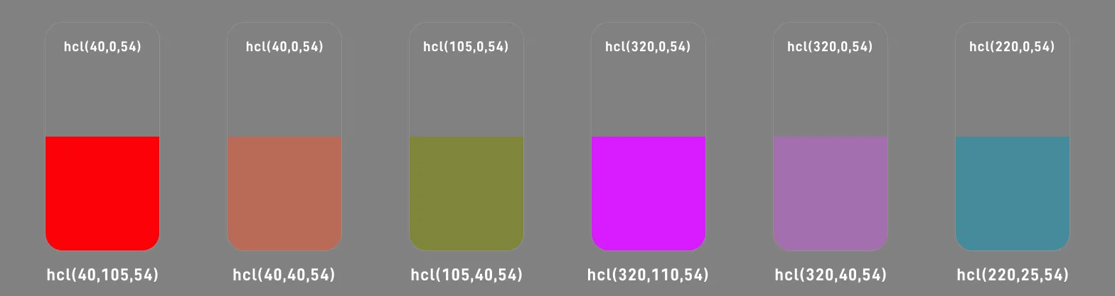
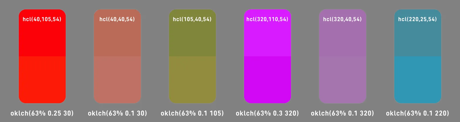
Helmholtz-Kohlrausch effect (Helmholtz—Kohlrausch effect) indicates that strong chromacity affects visual perception. Even under the same light source brightness, for human vision, colored light seems brighter than white light.
For example, in the following figure, all colors have L=54, but we find that the color with higher chromacity (color 1 and color 4) seems brighter.
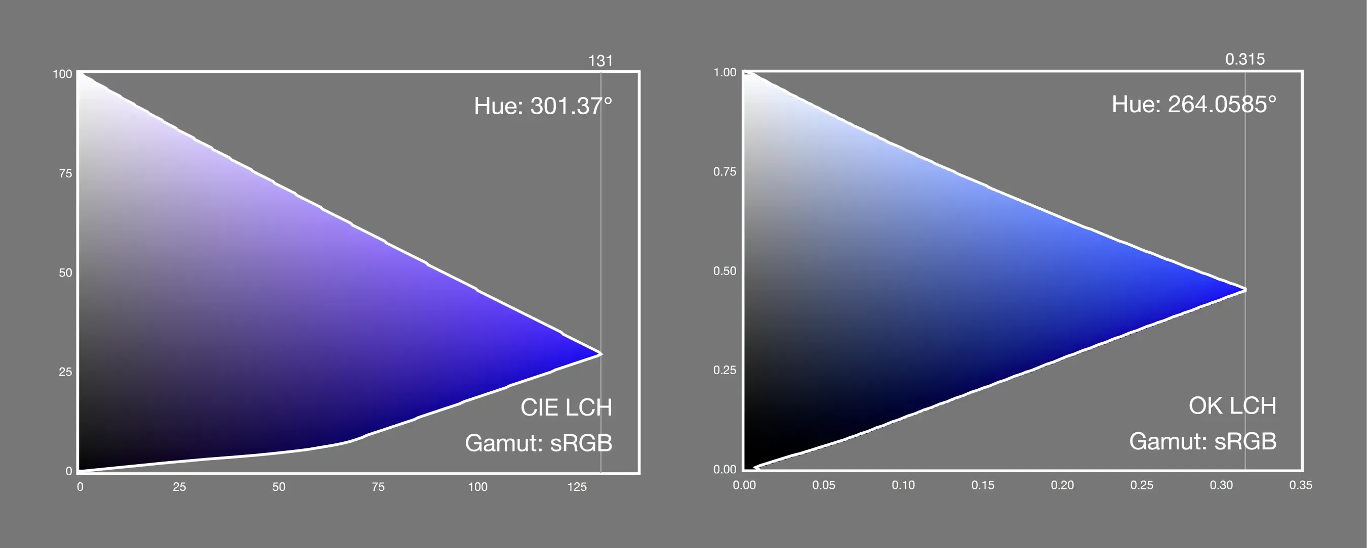
Abney effect refers to the perceptual hue shift that occurs when white light is added to monochromatic light. For example, when #460FF2 is combined with #FFFFFF, the color will appear purple-shifted.
HCL color space also has the same problem, for example, when H=303, L shifts from blue to purple from 0 to 100.
Conclusion
⛔️ HCL has hue shift in some hue areas
⛔️ Strong chromacity affects brightness perception, HCL’s perceived brightness is not uniform when facing chromacity changes
PS: CIELuv and its conversion form HSLuv are basically the same, but the compatibility and support scenarios are less.
OKLCH basically solves all the above problems
OKLCH color space (Lightness-Chromacity-Hue) is the polar coordinate transformation of OKLAB. Created by Björn Ottosson in 2020, based on the CAM16-UCS color space and the IPT color space with a simpler calculation mode.
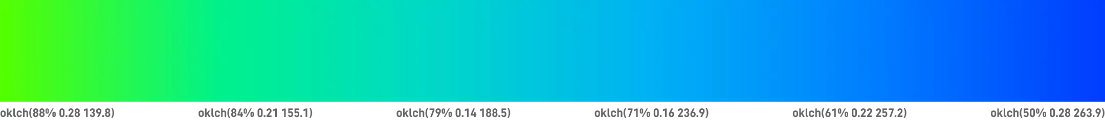
The common representation is oklch(``75% 0.1 360``) or oklch(0.75, 0.1, 360).
✅ OKLCH uses three easy-to-understand components: “perceived lightness L - chromacity C - hue H”
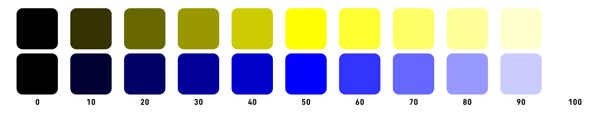
Perceived lightness Lightness
The range is 0 to 100%, 0% is #000000 pure black, 100% is #FFFFFF pure white.
Chromacity
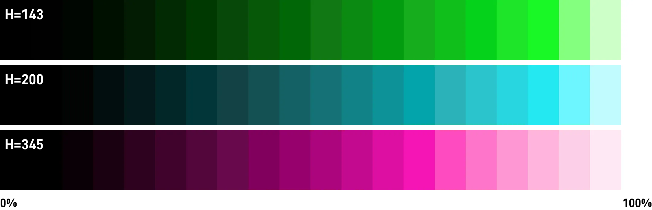
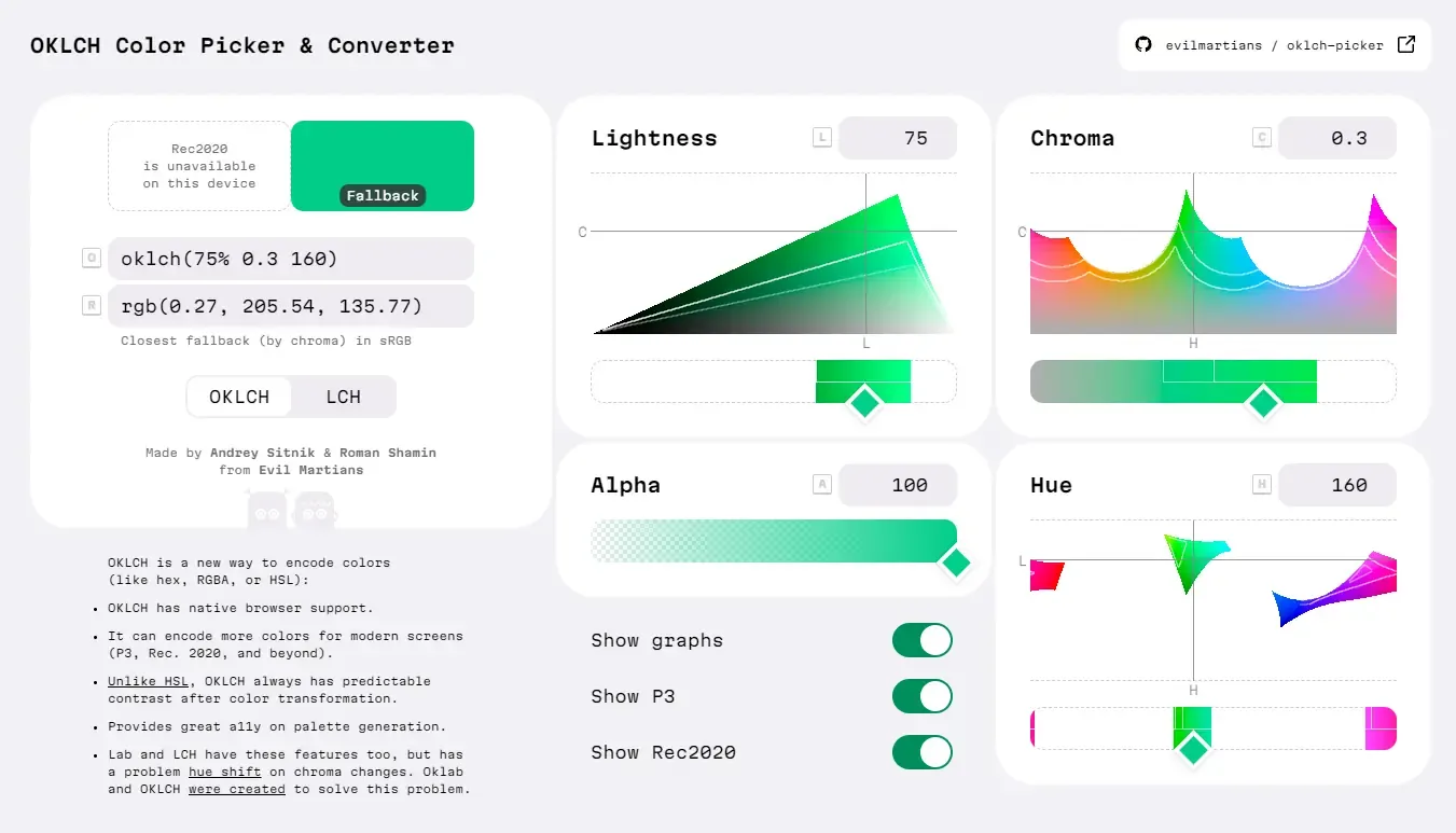
OKLCH supports chromacity without a limit, but the chromacity of sRGB or P3 is not higher than 0.37, and the chromacity of Rec2020 is not higher than 0.47.
Unfortunately, although the chromacity numerical value is uniform, the upper limit range of chromacity for different hues is quite different.
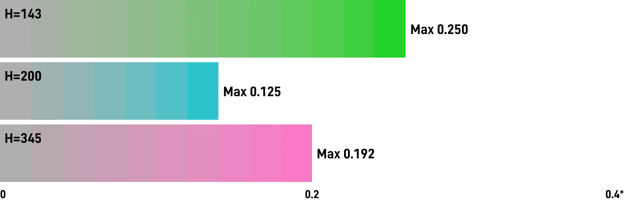
For example, mapping to the sRGB color gamut:
Hue
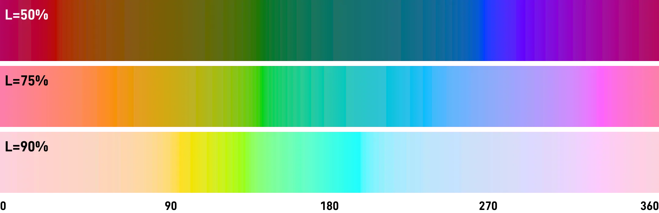
The method of use is basically the same as HSL, the range is 0 to 360.
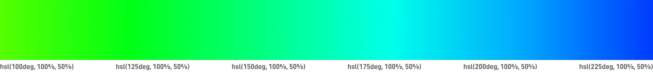
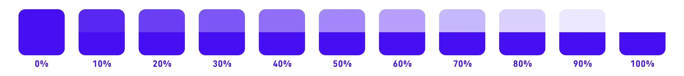
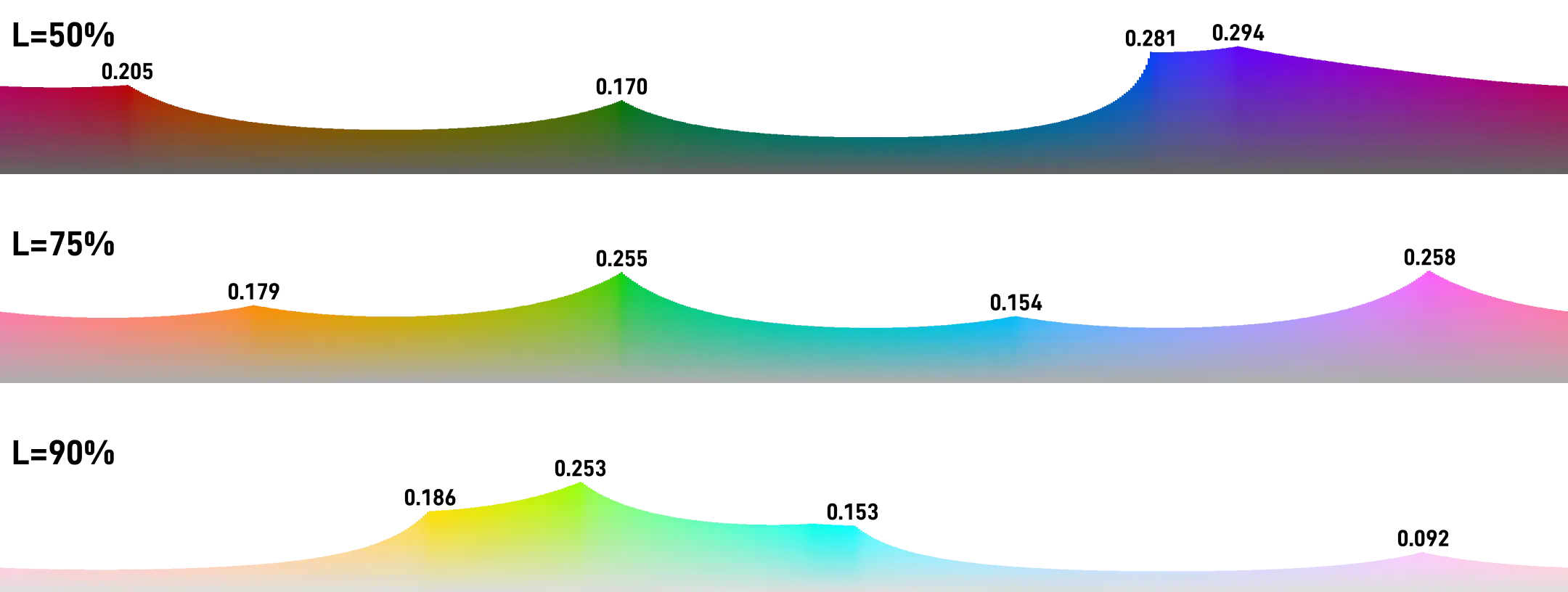
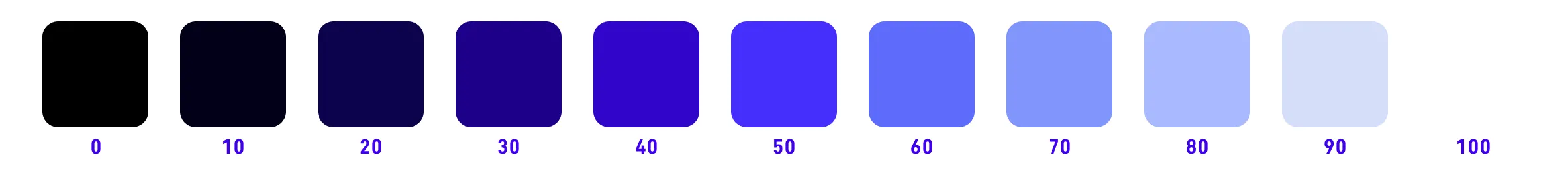
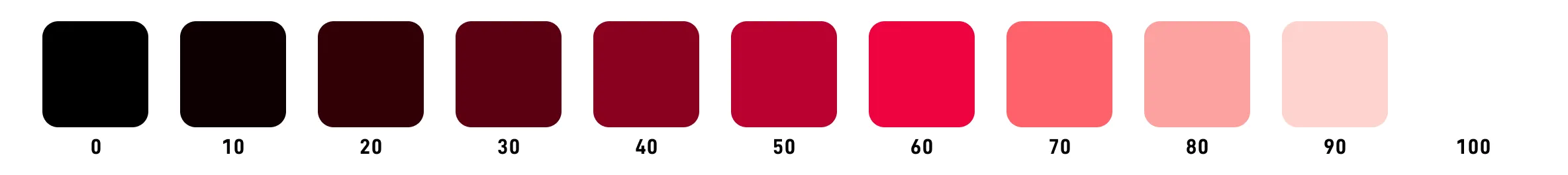
✅ OKLCH perceived lightness is uniform
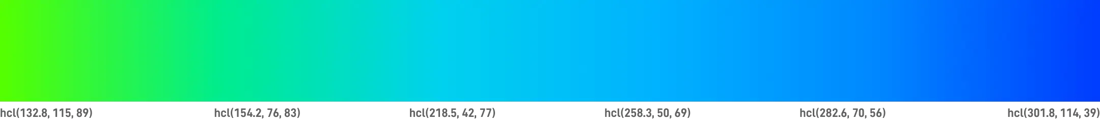
Below is an example of OKLCH when L=75.


The gradient based on OKLCH is even more uniform than HCL.
✅ OKLCH minimizes the impact of chromacity on lightness (Helmholtz-Kohlrausch effect)
OKLCH reduces the brightness of high chromacity and increases the brightness of low chromacity.
✅ OKLCH fixes hue shift (Abney effect)
- Image from https://www.w3.org/TR/css-color-4/#ok-lab
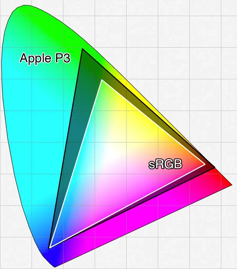
✅ OKLCH supports encoding for a wider color gamut (P3, Rec.2020 and higher)
The most practical one is Apple’s Display P3, which has been fully supported by iPhone, iPad (except for entry-level models), and MacBook in recent years, and the color range is almost 25% larger than sRGB.
From a long-term perspective, OKLCH is based on the entire visible range of the human eye, which means it is compatible with future device color gamuts.
Using OKLCH and other wide-gamut color spaces can provide a better experience for new devices.
- Image from http://www.astramael.com/
✅ oklch() has been added to the current CSS4 candidate version, and all major browsers are supported
For specific progress, please refer to the candidate content of CSS Color Module Level 4 by the W3 working group.
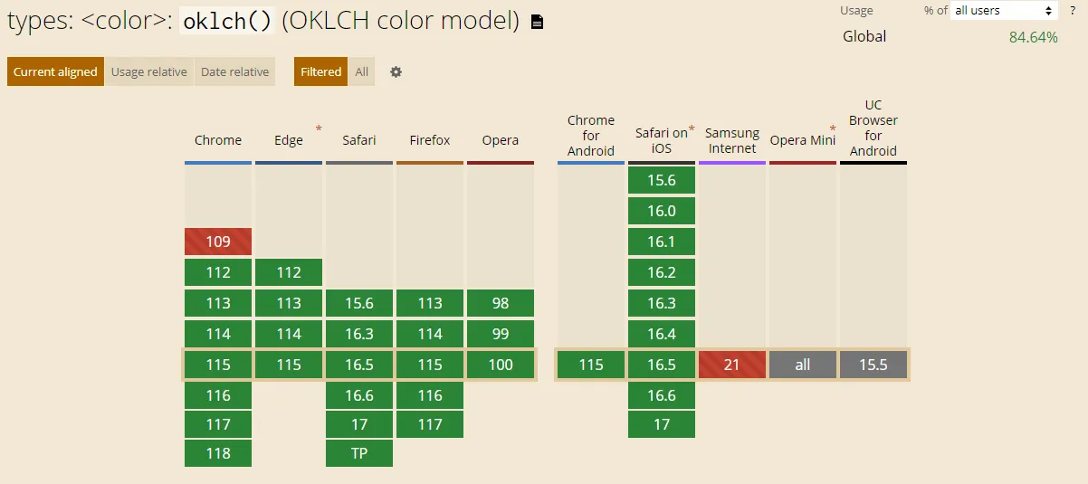
Compared to other newer color spaces, the speed of ecosystem compatibility and support is very fast.
⛔️ The shortcomings of OKLCH
- Currently still in the early stages, the ecosystem is not yet complete;
- In order to ensure the uniformity of chromacity values, the chromacity component has invisible numerical combinations;
- In the low brightness range (L<10), the distinction is relatively weak on some devices;
- According to APCA calculation, the perceived lightness L corresponding to the middle position of gray is approximately 71.55%.
PS: HCT color space is a new solution launched by Google in Material Design 3.0, based on the CAM16 color space and Lab color space, and is currently relatively complex to implement, and is also worth paying attention to.
Selecting colors in the OKLCH space
We take OKLCH Color Picker & Converter as an example.
https://oklch.com/#75,0.1,300,100
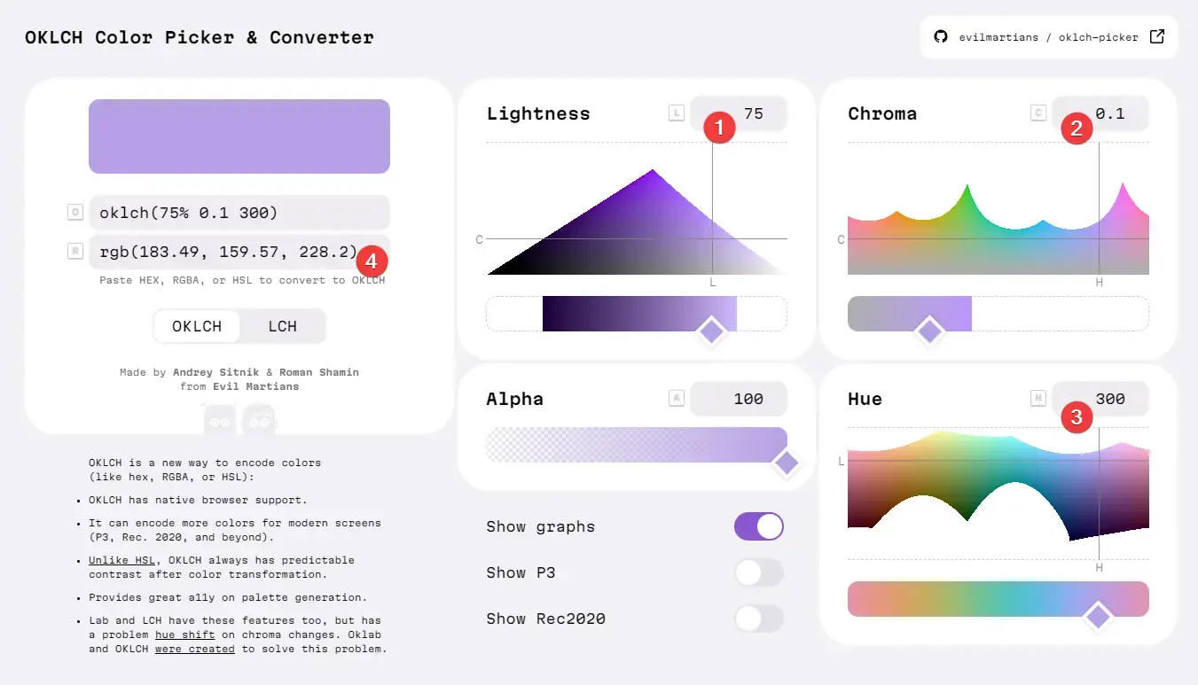
- Lightness L input
- Chromacity C input
- Hue H input
- Output color
Generally, we will first select the hue H, set the L gradient, and finally select the color you prefer within the limited chromacity range.
Note that due to the smaller color gamut of sRGB than OKLCH, colors outside the range may not be displayed on your device.
My Figma color plugin is online - Palette lap
- Generate color palettes, generate variables
- Applied OKLCH and APCA, resulting in color levels with highly predictable contrast
- For example, the foreground color of Level 80 and the background color of Level 20, it must produce an APCA score of 60 or higher https://www.figma.com/community/plugin/1266402926106098747/Palette-From.Red
Next
OKLCH is currently very strong in development, and almost confirmed a place in the new generation of color schemes.
If you are building or rebuilding a color system, OKLCH is definitely one of the best choices.
This article is mainly focused on introducing and recommending which color space to choose, if you want to build a complete color system, you can look forward to the follow-up articles.
Thank you for reading.
Resources
Reference articles
-
OKLAB and OKLCH
-
Other color space comparison analysis
- Two new color spaces for color picking - Okhsv and Okhsl
- Why HCL
- HCL Color Scheme
- LCH colors in CSS: what, why, and how?
- LCH is the best color space!
- Product color 2.0: using HCL color space instead of HSL to generate color schemes
- The Expanding Gamut of Color on the Web
- Accessible Palette: stop using HSL for color systems
- Why I Love HSV, and Why It’s Totally Useless
- How To Avoid Equidistant HSV Colors
- Accessible-as-possible colour palettes - Henry Lau
- Perceptually uniform color spaces - Programming Design Systems
Tools
- Palette lap
- OKLCH Color Picker & Converter
- OKLCh color picker
- chroma.js
- Huetone - Make colors accessible
Update History
- 2022-09-02 v1.0.0 First version
- 2022-10-26 v1.0.1 Add reference article OKLCH in CSS: why we moved from RGB and HSL
- 2023-02-13 v1.0.2 Add reference article OK, OKLCH: a color picker made to help think perceptively
- 2023-05-22 v1.0.3 Add reference video Thinking on ways to solve color palettes
- 2023-08-02 v1.1 Update browser compatibility, currently all major browsers support the
oklch()method - 2023-08-09 v1.2 Update Figma plugin