How to scientifically evaluate whether the color combination of text and background can be seen clearly?
Summary
Background
- For designers, you may be building a color system in your product design
- It’s better to understand WCAG 2, and have heard or practiced the requirements of contrast 3:1, 4.5:1, and 7:1 in color selection
Best Practices
-
If your product has a dark mode (Dark Mode), please do not rely on WCAG 2, it almost doesn’t work
-
Prioritize applying APCA to calculate contrast in practice, even though APCA is still being improved
-
The recommended practice standard for transplanting WCAG 2 to APCA
- 75 corresponds to
WCAG 7:1 - 60 corresponds to
WCAG 4.5:1 - 45 corresponds to
WCAG 3:1
- 75 corresponds to
-
If your product has a legal or other policy constraint on WCAG 2, consider forward-compatible WCAG 2 on the basis of APCA
- 90 corresponds to
WCAG 7:1 - 75 corresponds to
WCAG 4.5:1 - 60 corresponds to
WCAG 3:1
- 90 corresponds to
-
Before WCAG 3.0 is officially released, it is recommended to not consider the influence of font in APCA in practice, and it is recommended to use WCAG 2 contrast values as an alternative
-
Note: Since APCA is still being improved, it may mean potential modification costs
- ACPA latest update: October 2021: APCA BASE | APCA
Gu Wei, Product Designer.
WCAG 2 Status
1.4.3 Contrast (Minimum) (AA)
The visual presentation of text and text images has at least a contrast ratio of 4.5:1, except for the following:
- Large text Large text and large text image contrast ratio of at least 3:1…
- --- WCAG 2.1
When building a color system, we usually check the contrast based on WCAG 2, and the larger the contrast value, the better. We generally select color combinations that are greater than 4.5:1 for body text and greater than 3:1 for titles.
For example, we selected a color scheme that is slightly green:

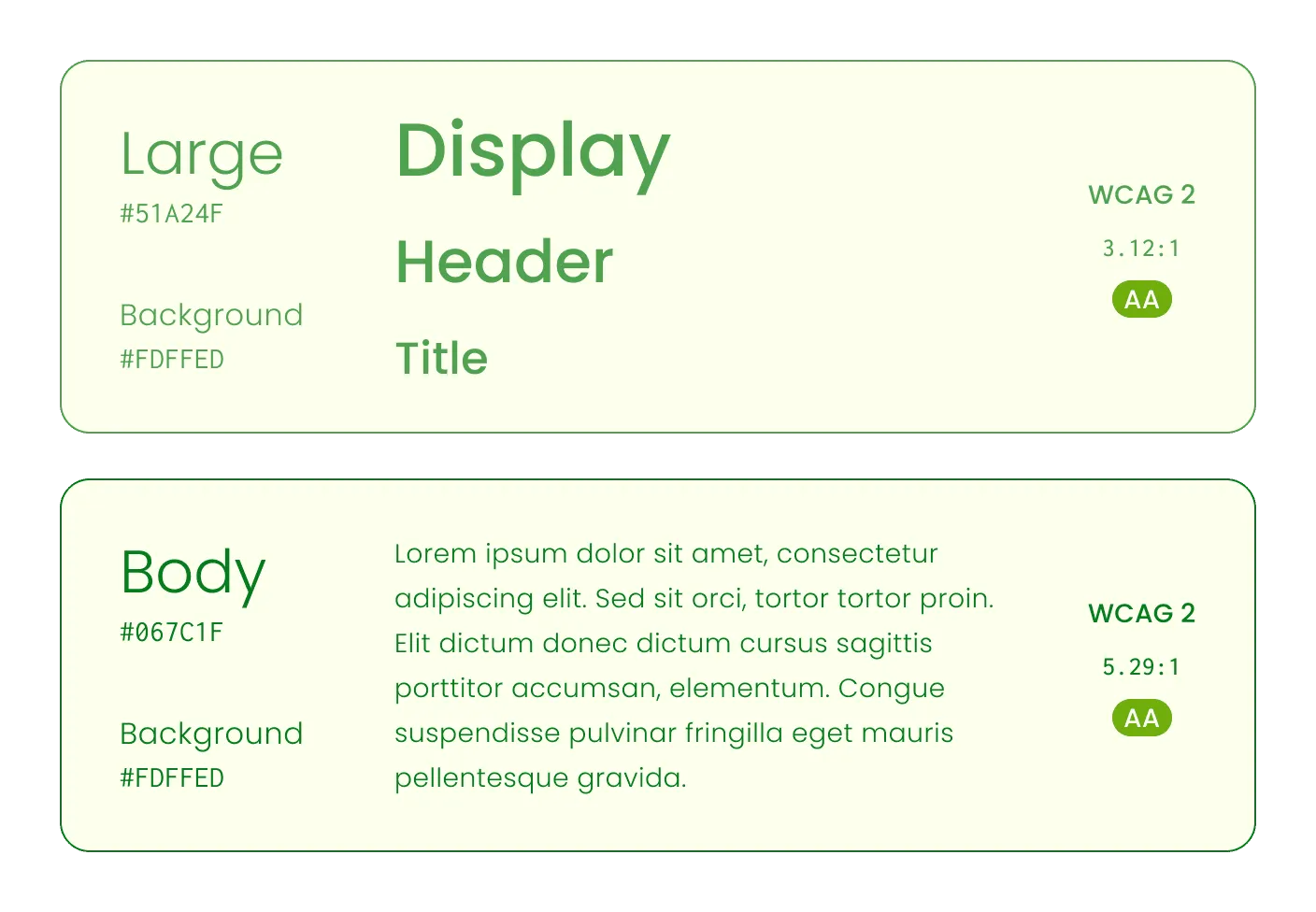
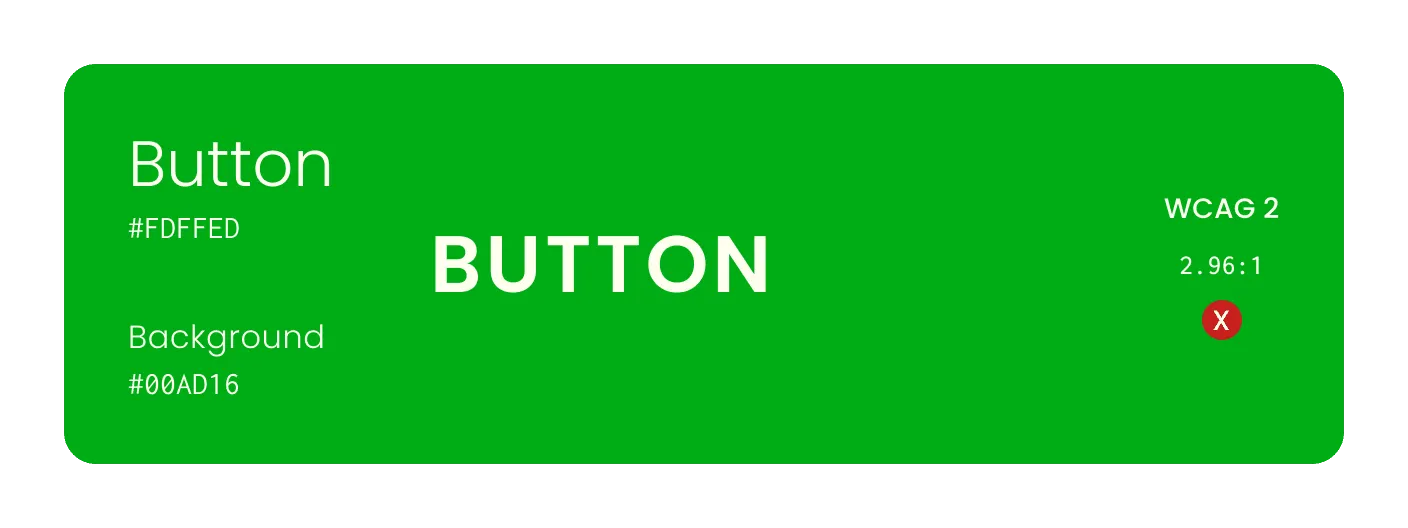
It’s great, #51A24F is used for the large title, the contrast ratio is 3.12:1; #067C1F is used for the body text, the contrast ratio is 5.29:1. Both have met the AA level requirements of WCAG 2. However, when we wanted to pair a button’s main background color, we found that the original green #00AD16 was below 3:1 and did not meet the requirements of WCAG 2.
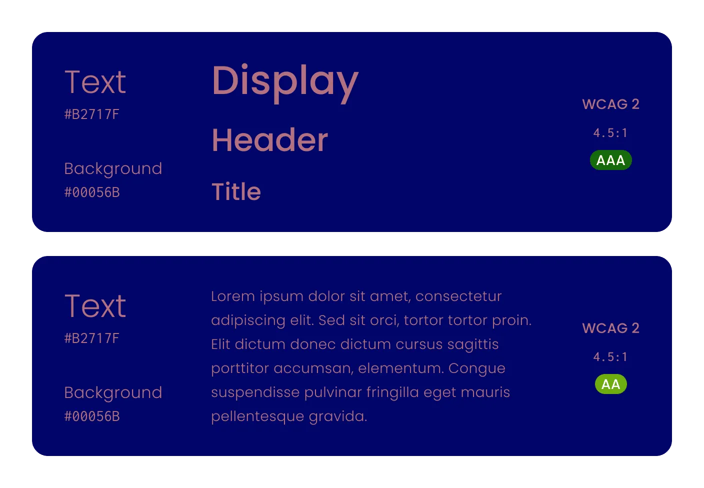
However, this blue background, pink text scheme has a contrast ratio greater than 4.5:1, which has achieved AAA for the large title and AA for the body text. This makes us wonder if WCAG 2’s contrast calculation is universally applicable.
The problem is that WCAG 2.x uses a completely brightness-based calculation method, essentially the relative brightness of the lighter color (L1) divided by the relative brightness of the darker color (L2):
Contrast = (L1 + 0.05)/(L2 + 0.05)When there are 20 lights illuminating a room, physically the luminous flux from 20 lights is indeed twice that of 10 lights, but the human eye will only perceive it as slightly brighter. This is because human brightness perception is not linear and is highly susceptible to the influence of surrounding environmental colors.
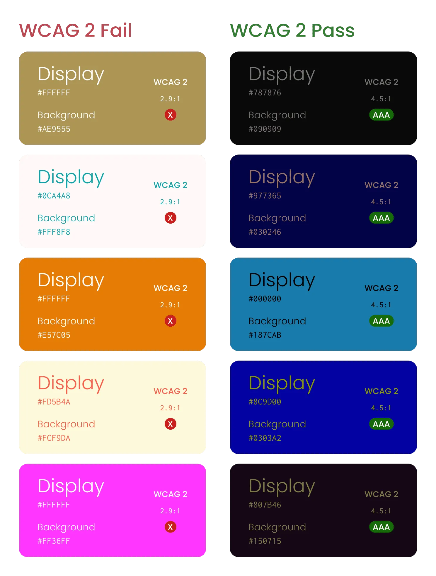
The brightness-based WCAG 2 will excessively exaggerate the contrast weight of dark colors. On one hand, it will reject some color combinations that are actually relatively easy to identify (left column examples), and on the other hand, it will pass some that are more difficult to identify (right column examples)*:
Depending on the individual’s eye condition, the device you are reading on, and the ambient light situation, the demo may have some controversy.
- Myndex™ - Experimental Vision Research contains more WCAG 2 accessibility experiments.
So we conclude:
The accessibility represented by the contrast ratio of WCAG 2 is not uniform, and the difference in perception under certain conditions is huge.
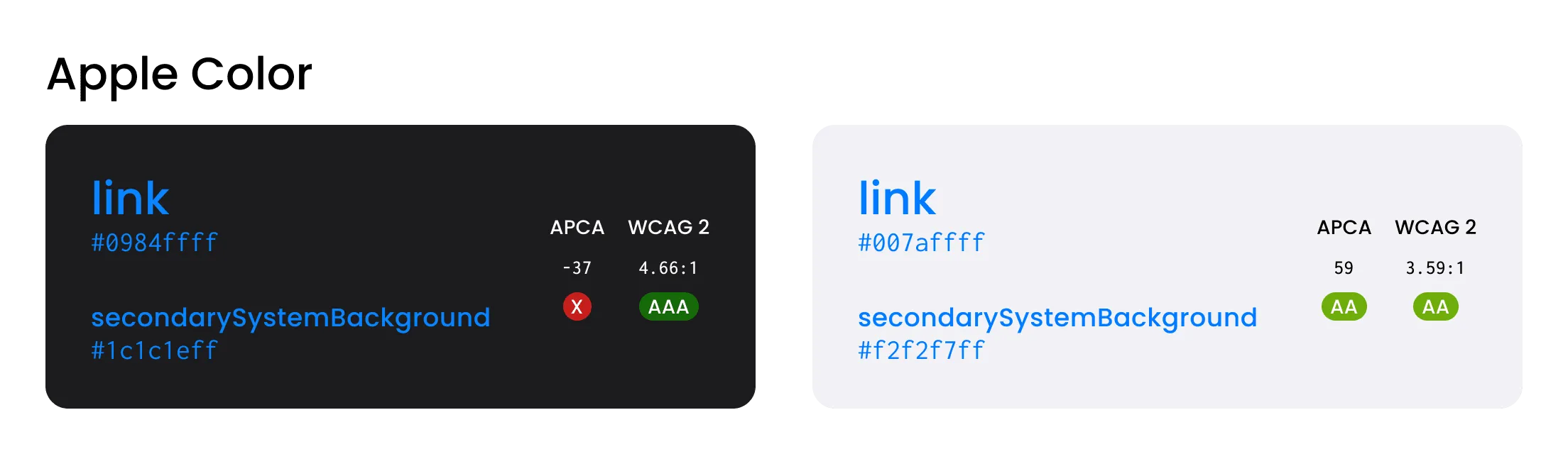
It is more serious that this leads to poor color performance in many products in dark mode, such as the WCAG 2 contrast ratio of the “link” blue and background provided by Apple in the system color palette of iOS, which exceeds 4.5:1, but the actual contrast ratio is much lower than in light mode.
Introduction to APCA
Many people have found the problem with WCAG 2’s contrast calculation, but many designers also believe that the contrast AA/AAA requirements are just a post-output checker, and more in the design process is still “to have enough confidence in your own intuition”.
For a mature design process:
- On the one hand, designers need to use tools and algorithms to evaluate the final color output;
- On the other hand, designers should also be able to find a set of colors that meet the constraints when building.
Obviously, WCAG 2 has flaws in both aspects, so some big shots couldn’t hold back anymore.
Andrew Somers works in the film and television industry in Hollywood, mainly in charge of editing, color correction, visual effects, etc., and is visually impaired. He proposed a challenge to WCAG 2 in April 2019 on GitHub of W3C:
Later, he became one of the co-authors of WCAG 3 as a W3 invited expert, and currently proposed the APCA algorithm, which is a candidate solution in the visual contrast part of WCAG 3.0.
Accessible Perceptual Contrast Algorithm (APCA), based on font attributes, perceptual brightness differences between text and background, environmental and contextual factors, etc., aims to be closer to the actual perception of the human eye. The technical details are not discussed here, please refer to GitHub - Myndex/SAPC-APCA.
As a designer, you can directly use the related tools of APCA, usually selecting the foreground text color and background color, returning a perceptual brightness contrast value Lc, ranging from -108 ~ +106, positive for light background, negative for dark background.
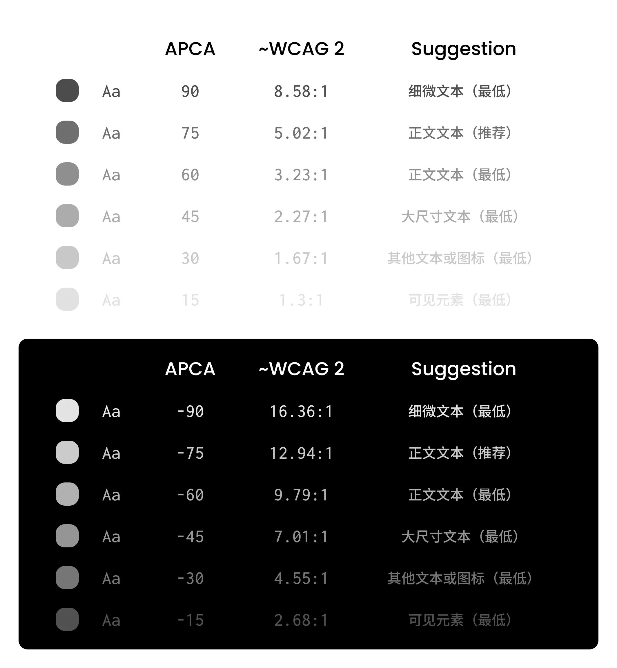
The approximate corresponding relationship recommended in practice:
- 75 corresponds to
WCAG 7:1 - 60 corresponds to
WCAG 4.5:1 - 45 corresponds to
WCAG 3:1
If your product has a legal or other policy constraint on WCAG 2, consider forward-compatible WCAG 2 on the basis of APCA:
- 90 corresponds to
WCAG 7:1 - 75 corresponds to
WCAG 4.5:1 - 60 corresponds to
WCAG 3:1
APCA Tools
Recommended: Figma Plugin - Visual Contrast
Recommended: Web - Contrast tools
- The interface is relatively friendly, the Lookup Table part can be ignored
- https://contrast.tools/
Similar tools
Web - APCA author’s tool
- The learning cost is relatively high, and the tool itself is not very usable
- The theoretical font, screen panel, environment, etc. are valuable for perceptual contrast, but are not practical in engineering practice at present
- The latest parameters and algorithms are only updated here
- http://www.myndex.com/APCA/
Web - BPCA
- APCA author simplified it for comparison with WCAG 2 contrast calculation
- http://www.myndex.com/BPCA/
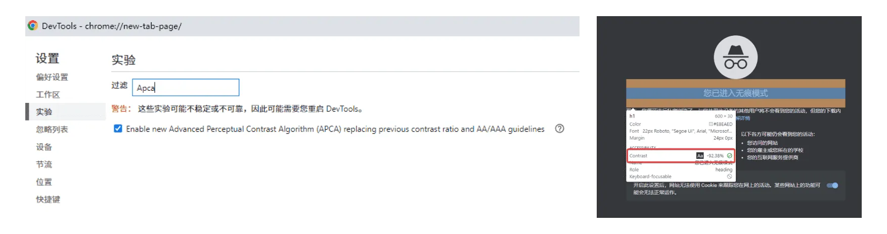
Chrome 89+ DevTools
- What’s New In DevTools (Chrome 89) - New color contrast calculation - Advanced Perceptual Contrast Algorithm (APCA)
- In DevTools, you can enable the experimental feature “Enable new Advanced Perceptual Contrast Algorithm (APCA) replacing previous contrast ratio and AA/AAA guidelines”
- Then you can use the selection tool Ctrl+Shift+C to hover over the text to view the APCA contrast. PS: Edge also has similar experimental features, no further discussion
Let’s compare WCAG 2 and APCA
Next, let’s use the official color palette of Ant Design to compare the two in practice.
In the functional color part, Ant provides eight pairs of color values for Link, Success, Warning, and Error in Dark and Light modes, let’s see their contrast:
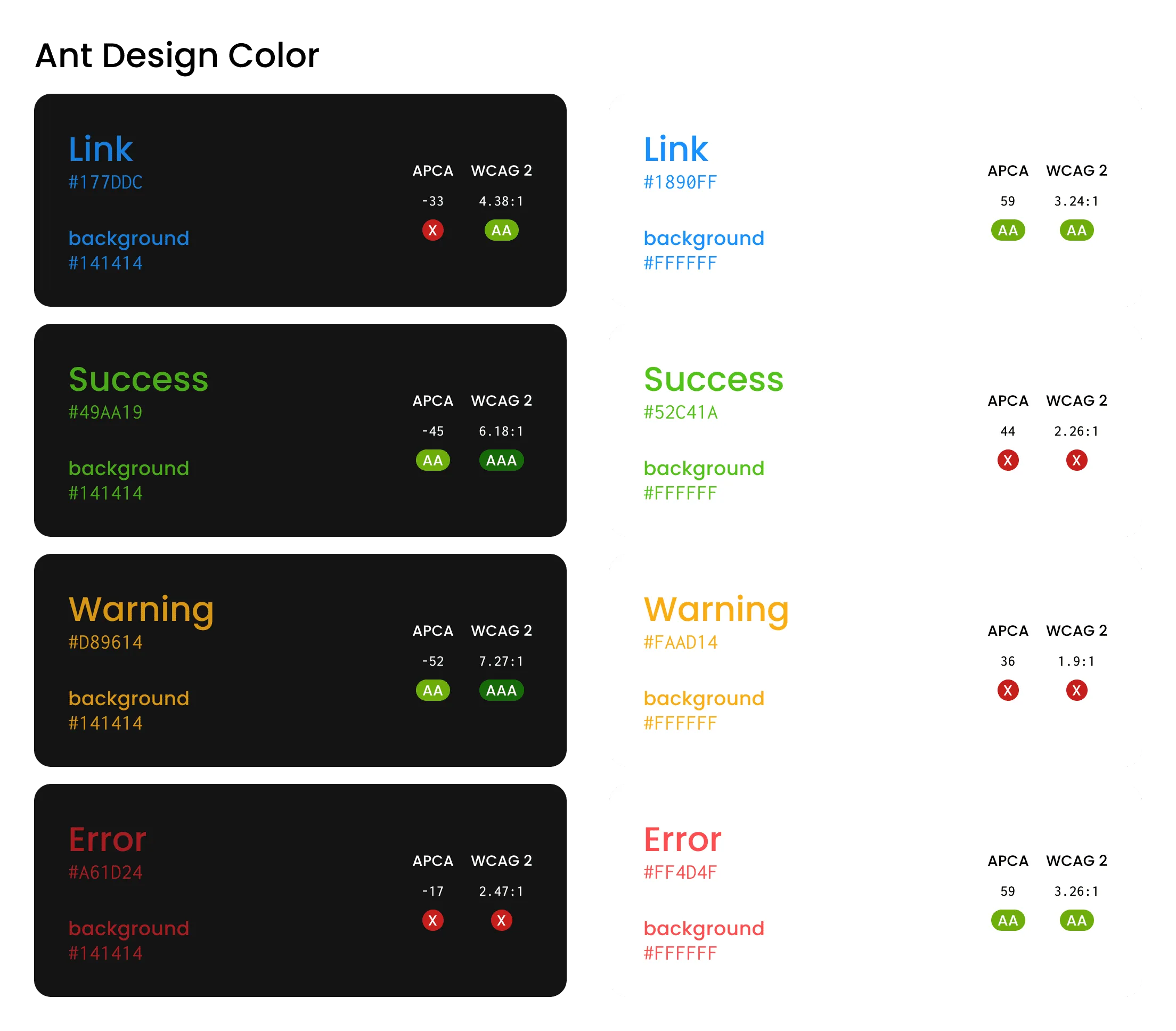
Based on WCAG 2, we found:
- Two pairs of combinations meet the AAA level, both in Dark mode;
- Three pairs of combinations meet the AA level;
- Three pairs of combinations do not meet the minimum requirements of WCAG 2 (I don’t know why, if you know, please let me know).
It seems there is something worth changing, which can improve color accessibility.
Let’s try to meet the minimum requirements of AA based on WCAG 2, let’s see the performance of the modified version:
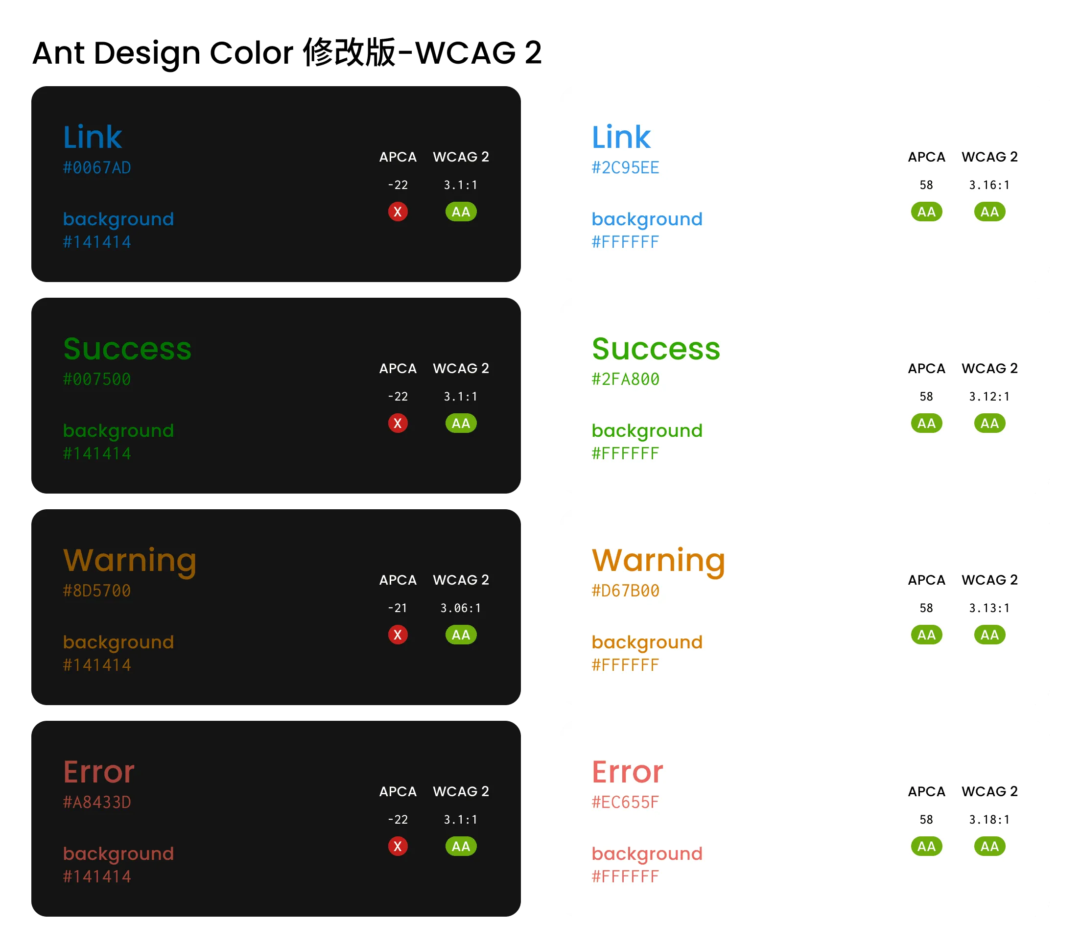
We can see that the contrast reflected by WCAG 2 is still relatively consistent in the same background environment. The main problem lies in the two modes of Dark and Light, the brightness feeling difference caused by the same contrast value is too large.
In addition, WCAG 2 is also difficult to cope with the challenges of complex scenes, such as different gray levels, or with color backgrounds.
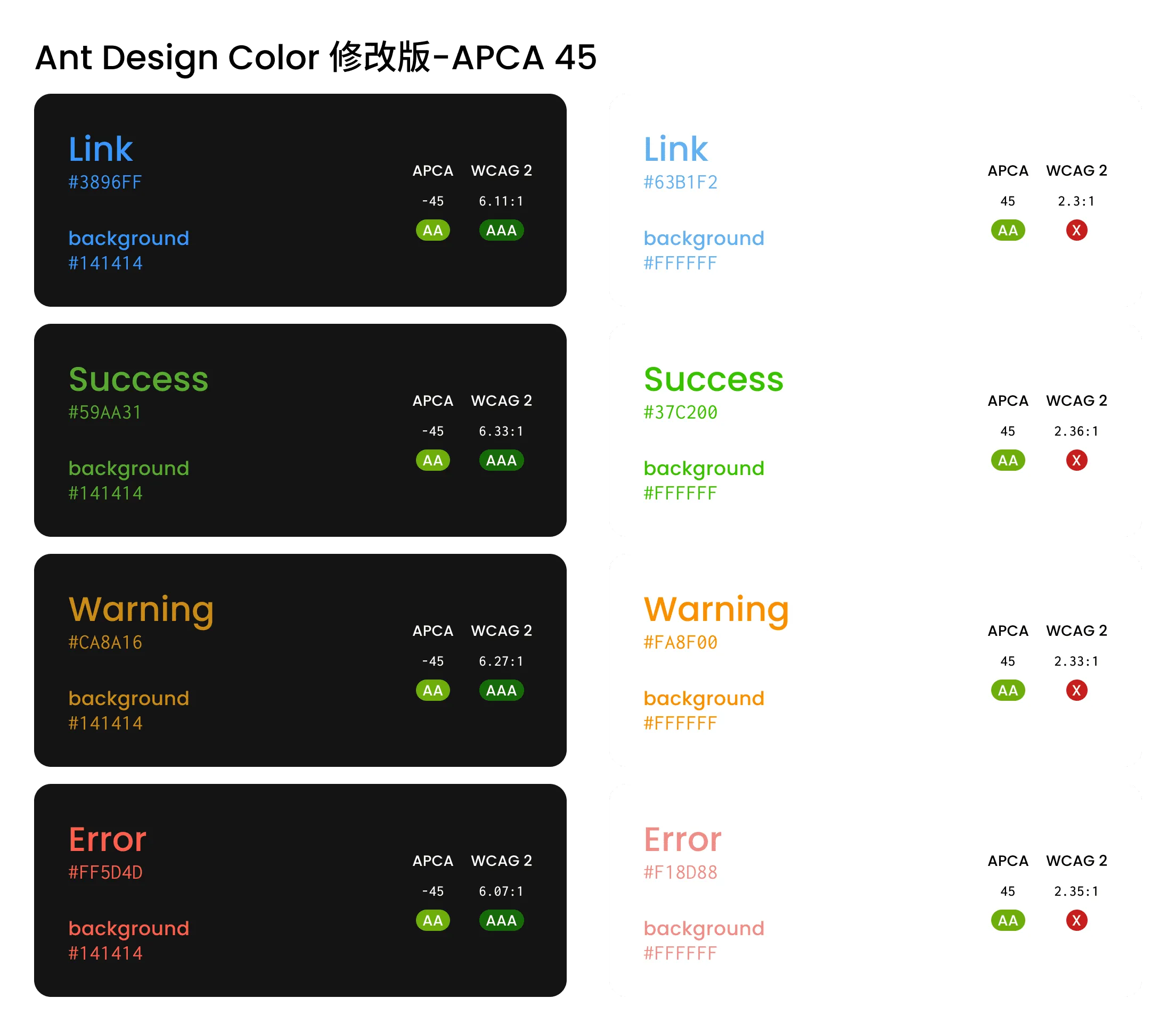
Here we introduce the APCA algorithm for adjustment, first try the contrast set to 45, meet the minimum requirements:
Or hope to meet the higher accessibility, and also compatible with WCAG 2 requirements, set the contrast to 60:
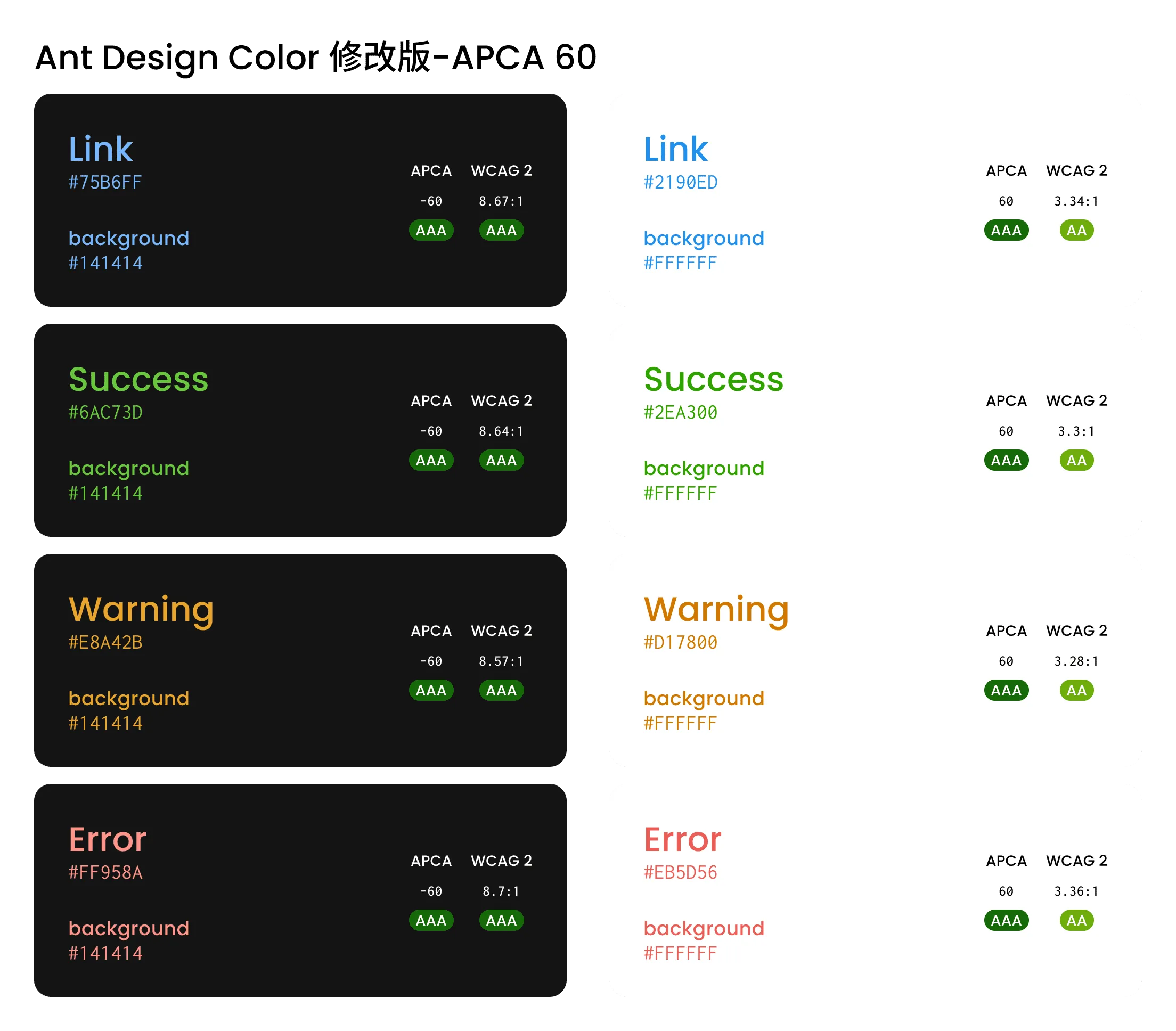
We can see that APCA performs more consistently in more scenarios, and the contrast values of WCAG 2 are significantly different.
Next
Currently, WCAG 3.0 has not been released, and since APCA is only one of the candidate methods, this will lead to certain uncertainty.
Considering that the standard will take a very long time to be widely applied, I urge各位 designers to try using APCA to solve practical color scene application problems, especially in dark scenes.
Whether it is WCAG 2 or APCA, these are not the only standards for choosing colors. As a designer, we should explore color schemes better on the basis of accessibility.
Thank you for reading.
Question
If you don’t plan to use APCA to evaluate color accessibility, what is the reason?
Resources
Reference Articles
- Web Content Accessibility Guidelines (WCAG) 2.1 Section 1.4.3
- W3C Accessibility Guidelines (WCAG) 3.0 Working Draft Section 3.5
- Visual contrast of text | How-To | WCAG 3.0 Draft
- Contrast Ratio Math and Related Visual Issues - Issue #695 - w3c/wcag
- WCAG 2 vs APCA Comparisons - Discussion #30 - Myndex/SAPC-APCA
- It’s time for a more sophisticated color contrast check for data visualizations - Datawrapper Blog
- The Realities And Myths Of Contrast And Color
Recommended APCA Tools
Recommended WCAG 2 Tools
Update History
- 2022-08-18 v1.0.0 First version
- 2022-09-09 v1.0.1 Supplement reference article The Realities And Myths Of Contrast And Color